Colours that inspire – the most interesting decors for spring
References
Spring is the time when the world comes to life – the trees start to green, the days get longer, and we feel like making changes. Maybe it is the perfect time to break away from monotony and add some energy to your interior? It is not about delicate accents or pastel accessories – this time, strong, bold colours come to the fore!
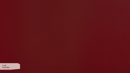
A bright red countertop? An intense dark blue wall? Or maybe a fresh lime green that will make even the cloudiest day start with a boost of energy? Colourful decors are not only a design trick, but also a way to create an interior that is bold and full of life.
A year ago, we ended our spring article with an announcement about decors in more intense, stronger colours. The time has come to present them!


Where can colourful decorations be used to their best advantage?
Intense colours do not have to mean a garish, overpowering interior. On the contrary – when used properly, they can give a space character, freshness and modernity. The key is to skilfully balance contrasts and combine colours so that the interior does not lose harmony.
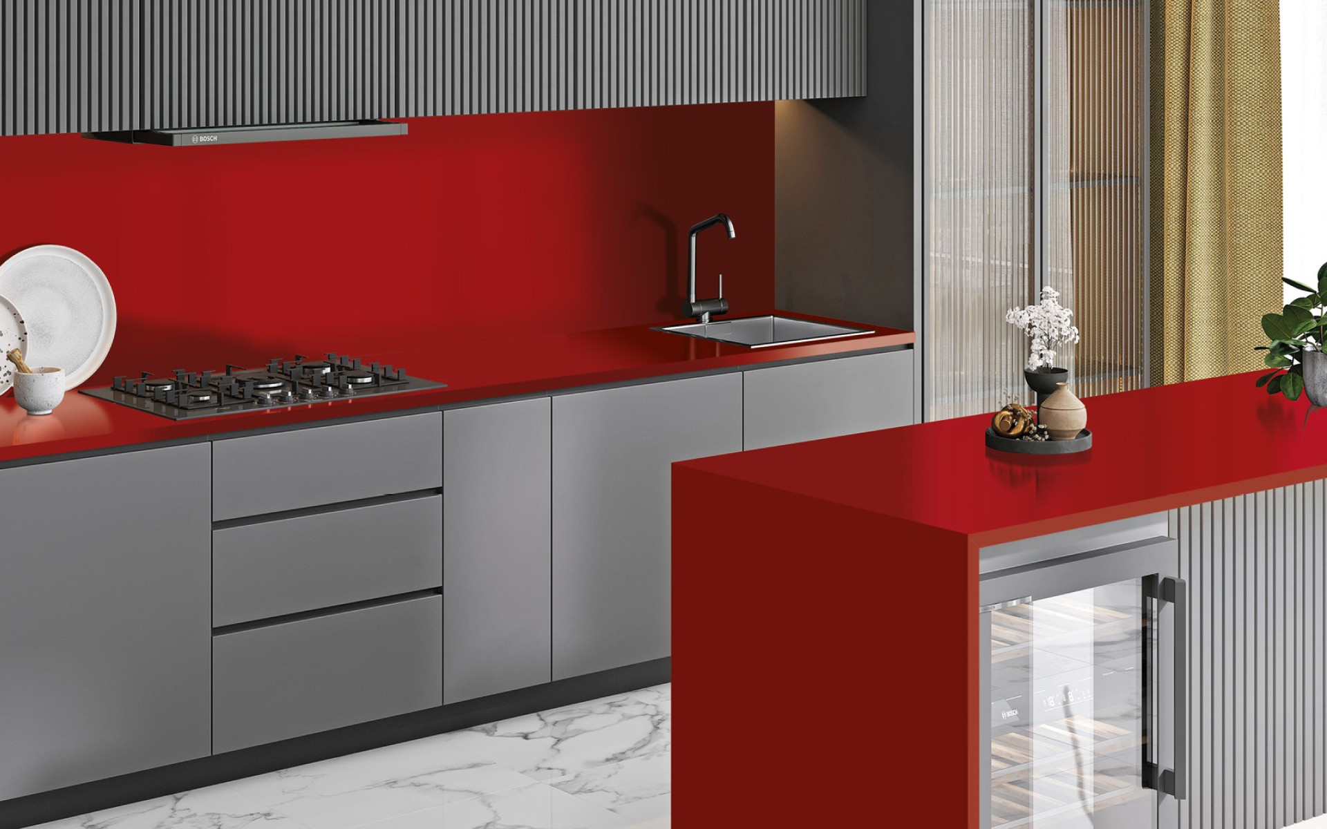
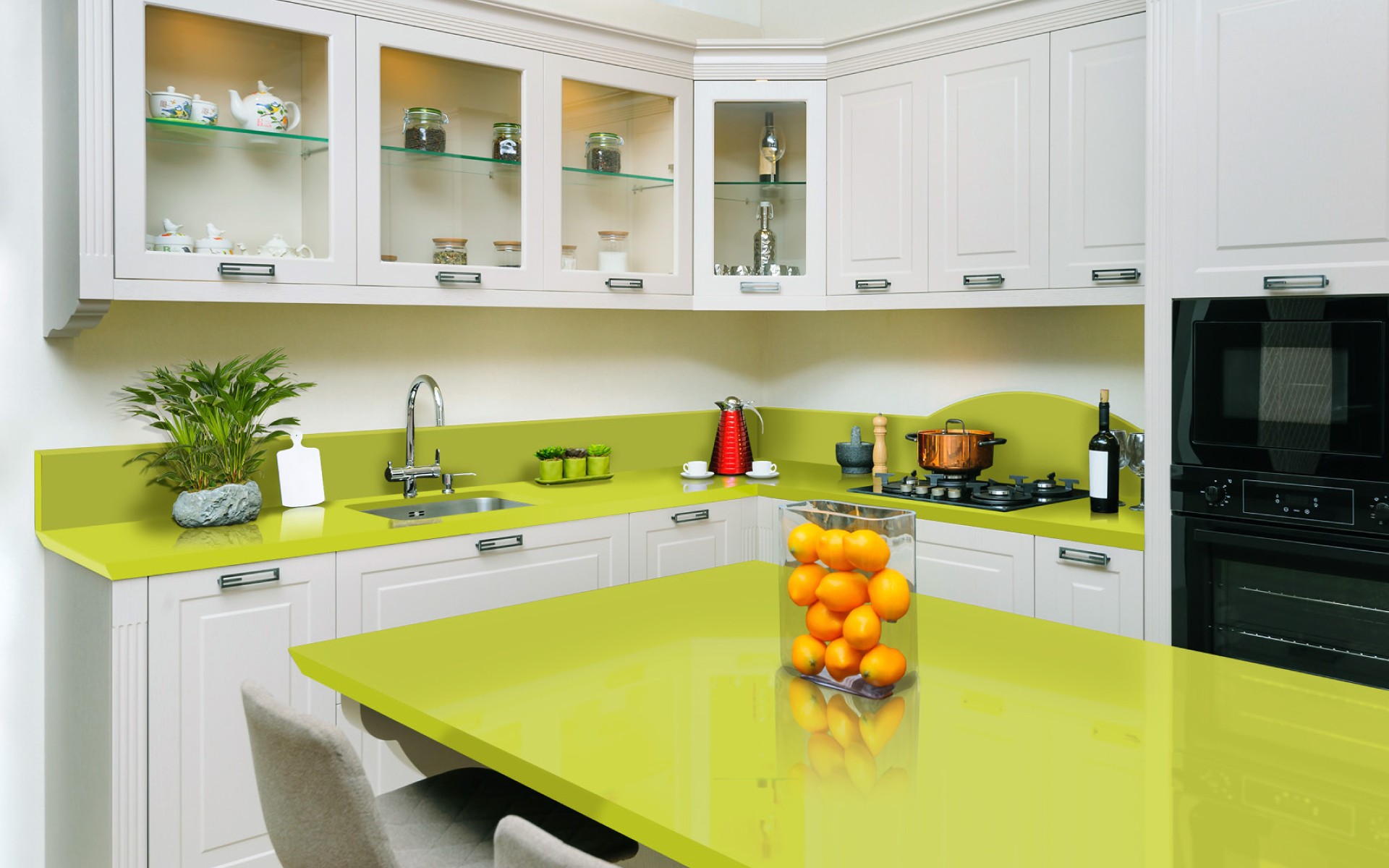
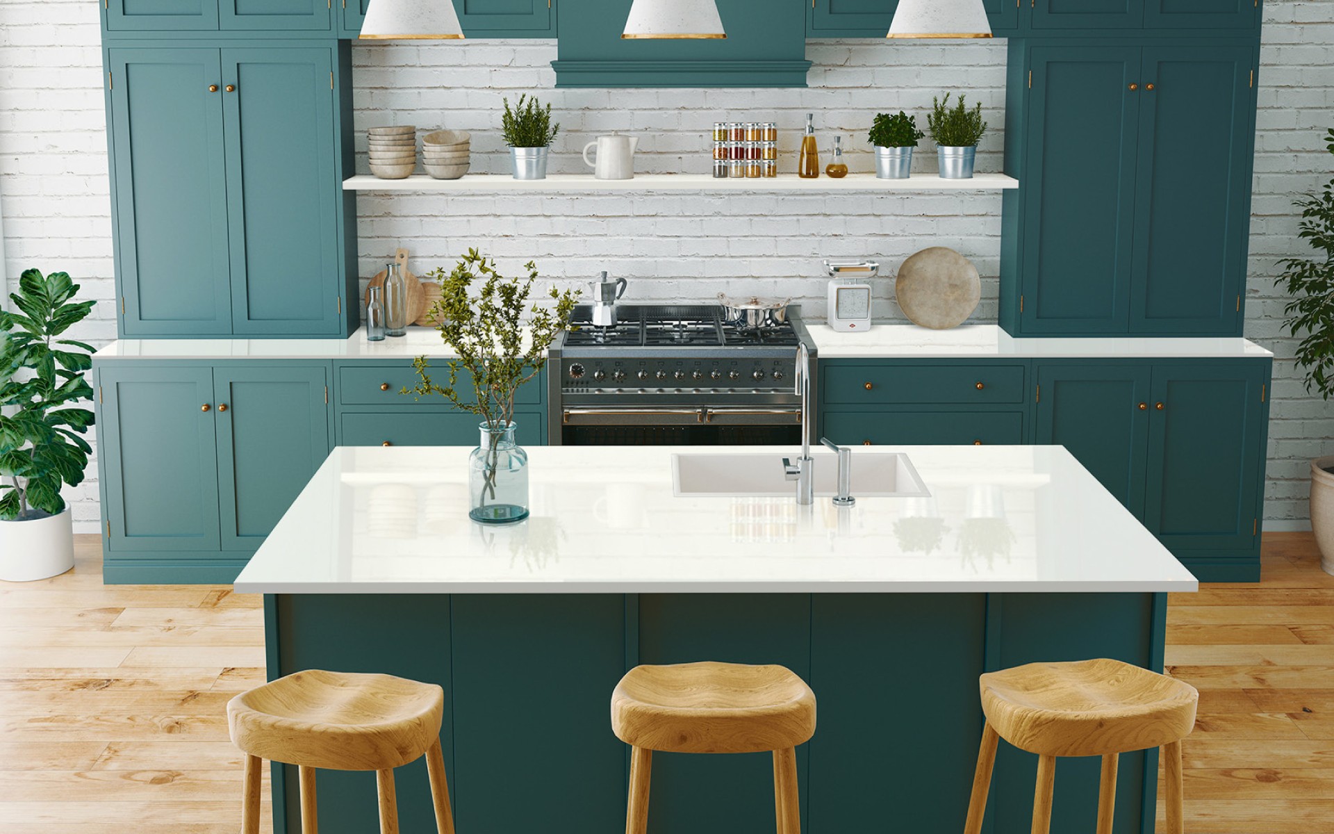
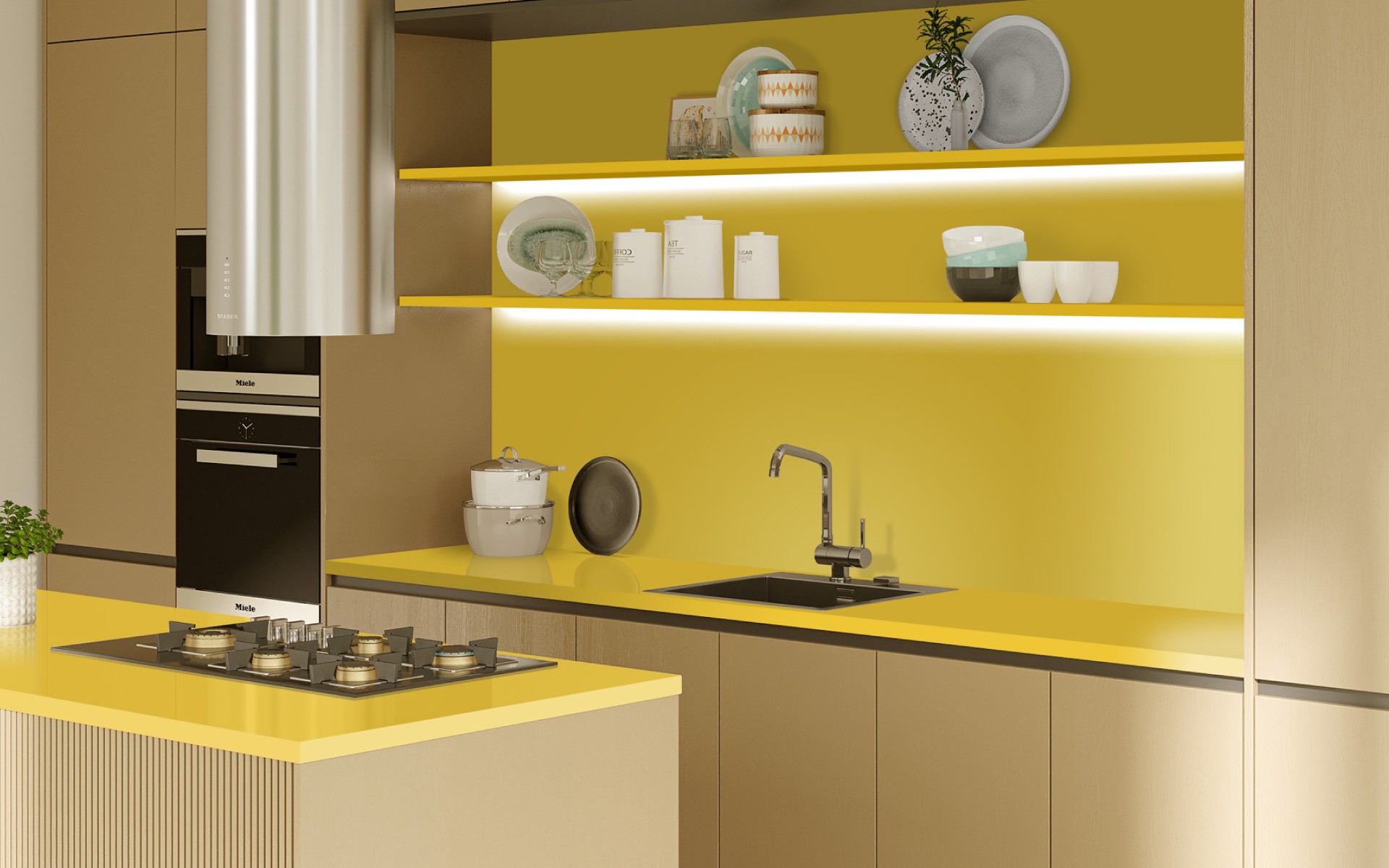
1. Kitchen
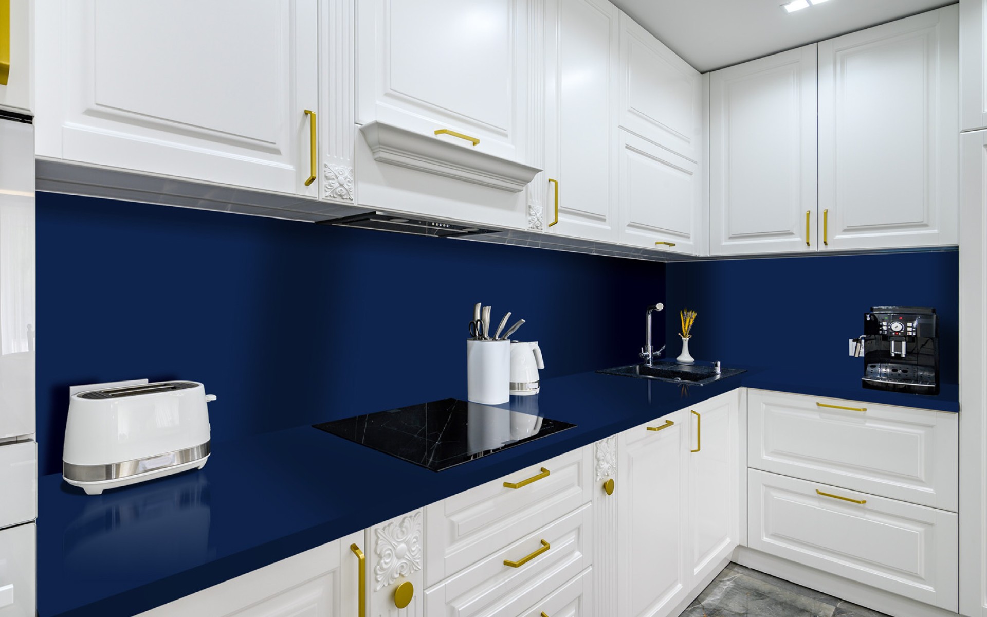
The kitchen is the perfect place for bold colours – after all, this is where we start the day, spend time with the family and experiment with cooking. A bright red worktop, a deep navy blue wall above the worktop or sunny yellow on the kitchen island can add a unique charm, freshness and energy (so needed in the morning!) to the interior. Strong colours go well with classic white cabinets, wooden accents or matte black fittings.
2. Bathroom
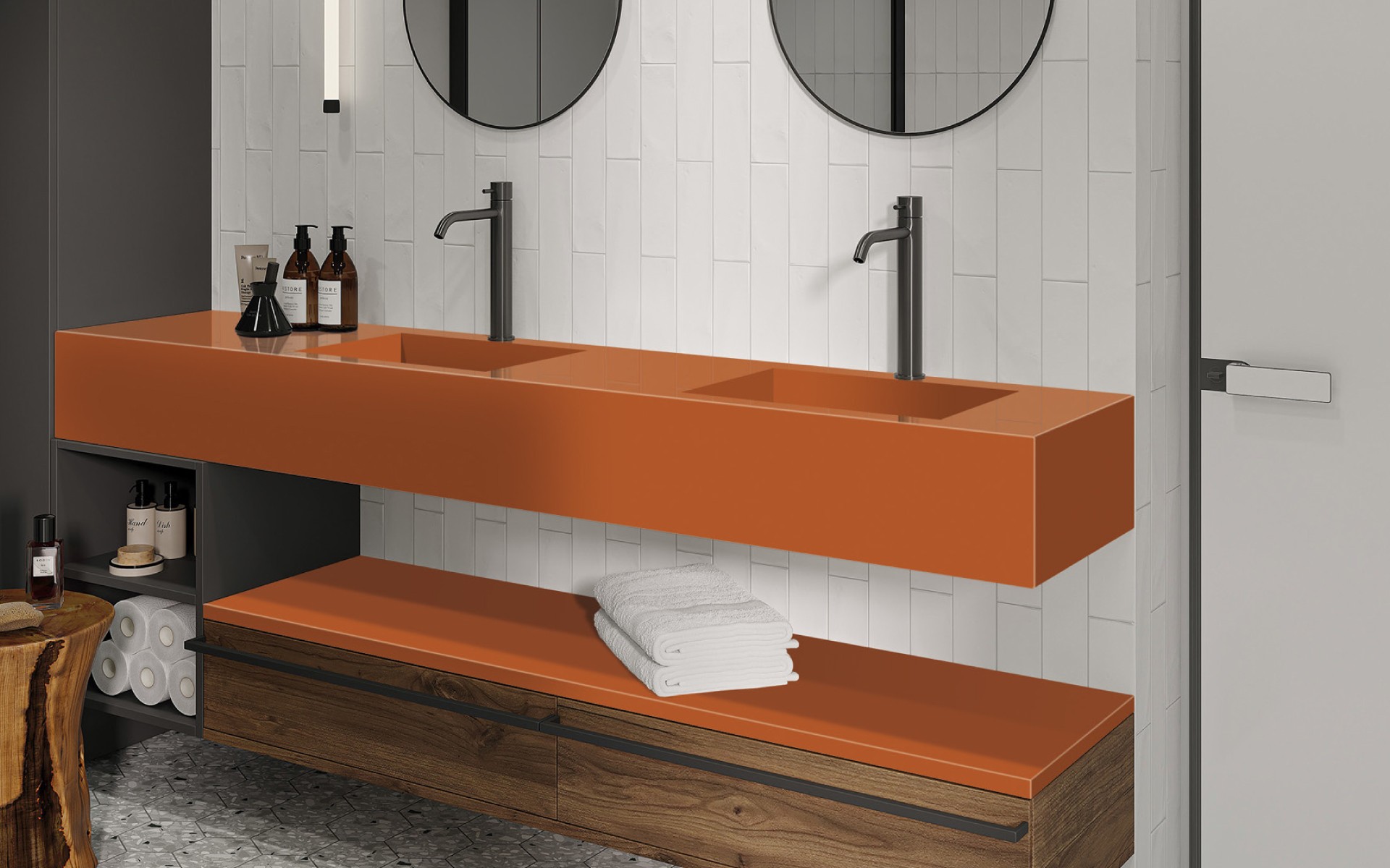
A bathroom in a vibrant colour? Why not! Warm orange, vibrant lime green or a dark blue background with contrasting white ceramics will give the interior a unique, luxurious look. Colourful countertops or sinks are also a great idea, as they become a decoration in themselves.
3. Living room
If you are afraid of introducing intense colours on a large scale, the living room is a place where you can test bold accents. A colourful coffee table top, shelves in an intense shade or a section of the wall in a strong colour will add originality to the interior without overwhelming the whole. Combining a vivid colour with a neutral base, such as white, grey or warm wood, will make the space dynamic, yet elegant.
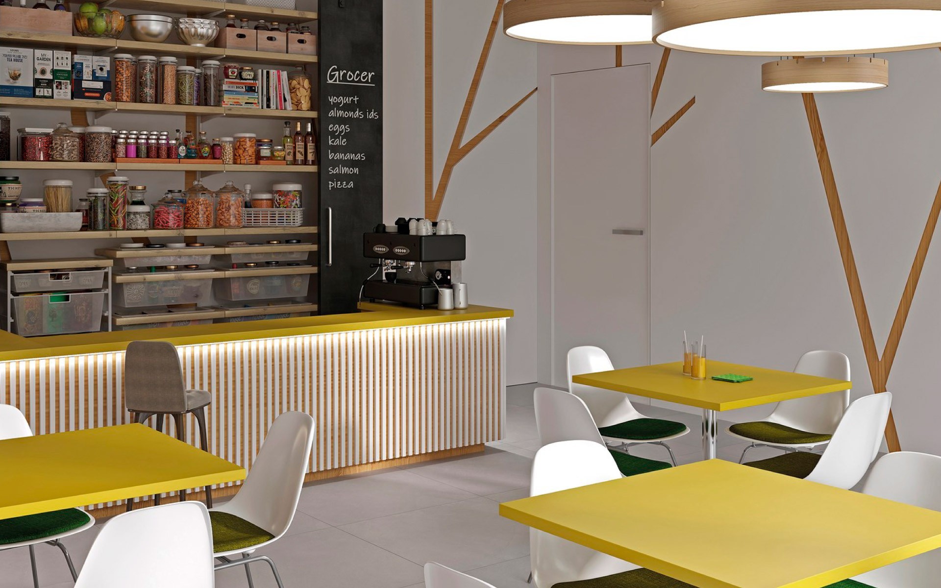
4. Commercial spaces – restaurants, offices, hotels
Public spaces are the perfect place for intense colours! In restaurants, colourful decorations can become a unique feature that guests will remember, in offices they can stimulate creativity, and in hotels they can distinguish common areas. In such places, you can afford to be a little more extravagant – strong colours on reception desks, bar tops or accent walls make the space distinctive and memorable.
Intense colour decors in the Architype range
All these decors are available in the GRANDEX acrylic solid surface collection. This material combines a modern look with exceptional durability. The pore-free, uniform structure makes the surfaces hygienic, safe for food contact, non-absorbent, non-staining and stain-resistant. Even with daily use, intense colours do not lose their depth and brilliance – you do not have to worry that after a few months your countertop or wall will look different than on the day of installation. GRANDEX is distinguished by its exceptional plasticity – it can be shaped freely, creating custom forms, curves and solids without visible joints. Maintenance is quick and does not require specialised chemicals, as a mild detergent and a soft cloth will be fully sufficient.
Strong, expressive colours are an easy way to create an interior full of energy and character. However, these are not solutions reserved only for the brave – when properly selected and combined with neutral accents, they can become an elegant and timeless element of the arrangement. So if you are wondering how to break the monotony, dare to use colour! Spring is the perfect time for change.
Check also: Expressive decors for characterful interiors
Share:

Other publications
All publications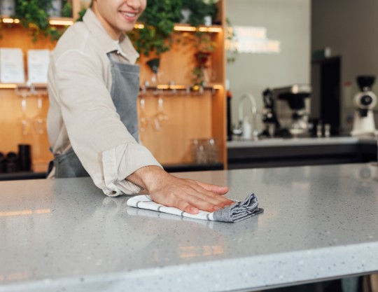
Natural stone care – how to clean, impregnate and protect its surface
References
Partial light transmission, a unique feature of onyx. How can it be used in interior design?
References
Natural stone in outdoor projects. Which type is best?
References